
Eddie Izzard once said in one of his hilarious stand ups that there is a circle of cool. Basically, its starts of by you looking like an idiot, then you look like a bit crap, then good, then cool, really cool, really really cool, so cool that you start to look like an idiot again.
Premier League kits in the 1990’s seemed to drift into the end of that phrase. Kit manufactures seemed to throw caution to the wind in a bid to outdo each other on the crazy stakes.
For this piece, I’ve delved into the archives and dig out some of my favourite worst kits.
They say when a bird poos on your shoulder its meant to bring you good luck. Through most of the mid 90’s, Spurs had as much luck as the Wile E. Coyote chasing the Road Runner. Umbro obviously thought we needed some light-hearted relief and came up with this below.
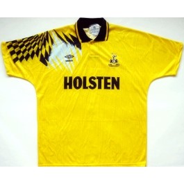
To this day I have no idea what the design is all about. Yet offer it to me for a decent price and ill bite your hand off. I did own the shirt once, went to watch my dad play cricket and got stung. Luck? Nope, just something to piss wasps off.
I continue the yellow theme by going to Nottingham Forest. At one stage, Forest boasted a front line of Collymore and Bryan Roy. Both left quite quickly and I’m wondering if this was to blame?
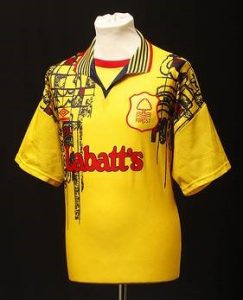
I wondered what to my drawings from nursery. I mean, what the hell is it trying to be? Part Picasso, part ‘ran out of ink in my bic’. Umbro are the villains again, I’m starting to think there was a strange smell coming from headquarters. Also, check out the size of the badge.
I’ll leave Umbro alone for a bit, I will be back though, and move on to our German friends of Adidas. Organised, sensible and very good. None of these apply to Newcastle’s away kit of 97/98 season.
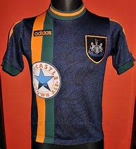
Who out of all of us have sat back and thought, ‘ah yes, orange and green really do well together’. Big badge again, maybe bigger. Maybe it was designed after one of Tino Asprilla’s parties. I mean even the sponsor is over to the side.
Pony were/are an American based company who in the late 90’s made kits for Spurs, Southampton and West Ham.
In my opinion it was the Saints who got the short straw.
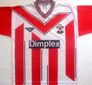
The collar is from the 1970’s and looks just as itchy. The stripes have some weird 3D affect going on. And then the main part that annoys me is the backwards tick. It’s probably the English in me, BUT ITS BACKWARDS!!!!. Matthew Le Tissier deserved better.
My last two circle back round to Umbro. Grey is the common theme. Neither, in my humble opinion worked.
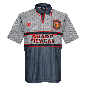
I know all you can see is a blank screen, but if you look really closely, you can make out the only kit to change at half time in a game. Sir Alex came out after the ill-fated loss at Southampton, saying his players couldn’t see each other. As excuses go that was a belter. To help they should have spoken to Chelsea.
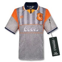
ORANGE! Of course. Easier to see and the big badge, again, even helps.
It’s just plain boring trying to be cool. Just ask the geeky kid who decides to wear trainers, yet the bottom of his ironed jeans seem to have argued with his socks, therefore are staying away from each other.
Please feel free to add your own. Also if you still own any of these masterpieces, send us a photo.